
The Lady gets a makeover
Client
Lady Gowrie
– Childhood Education Queensland
Project
Brand repositioning
1
Objectives
- Reposition 75 year old organisation to better represent their
current and growing footprint in QLD.
2
Strategy
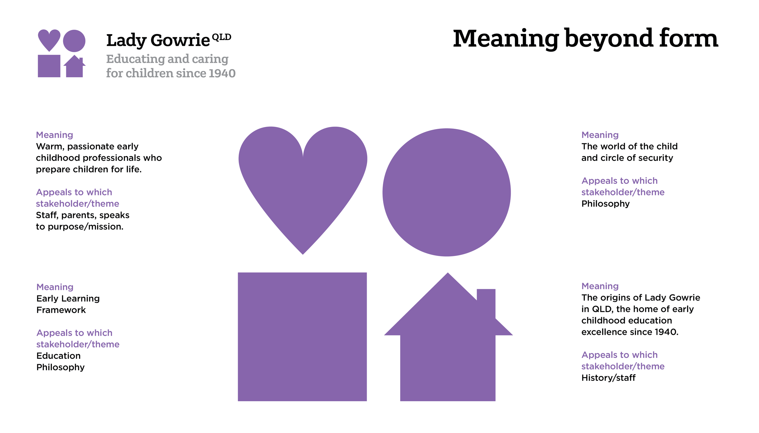
Tapped into Lady Gowrie’s core philosophy and passion for education
- Conducted stakeholder research
- Positioning workshop with Board members
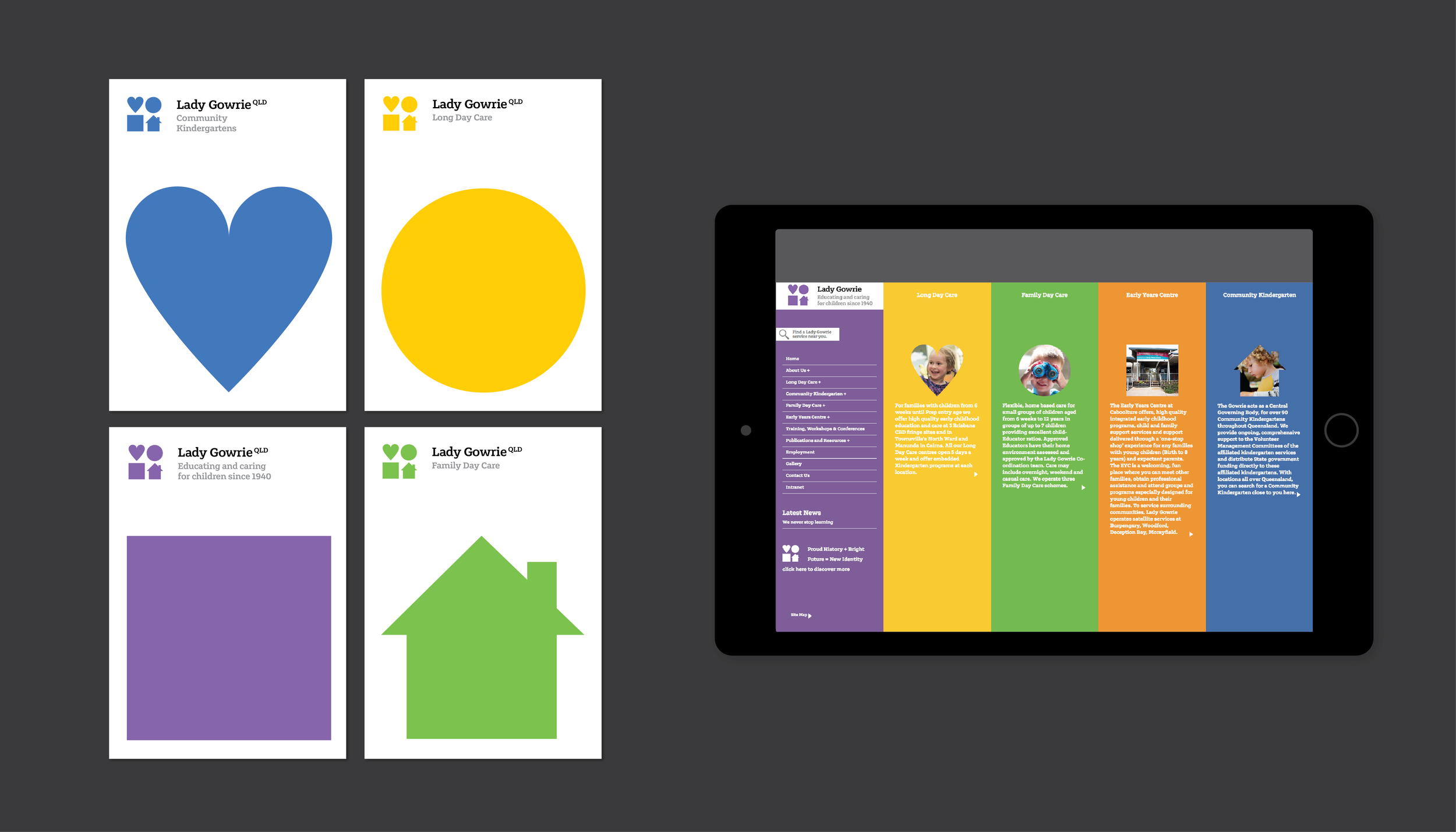
- Delivered new identity and Website
3
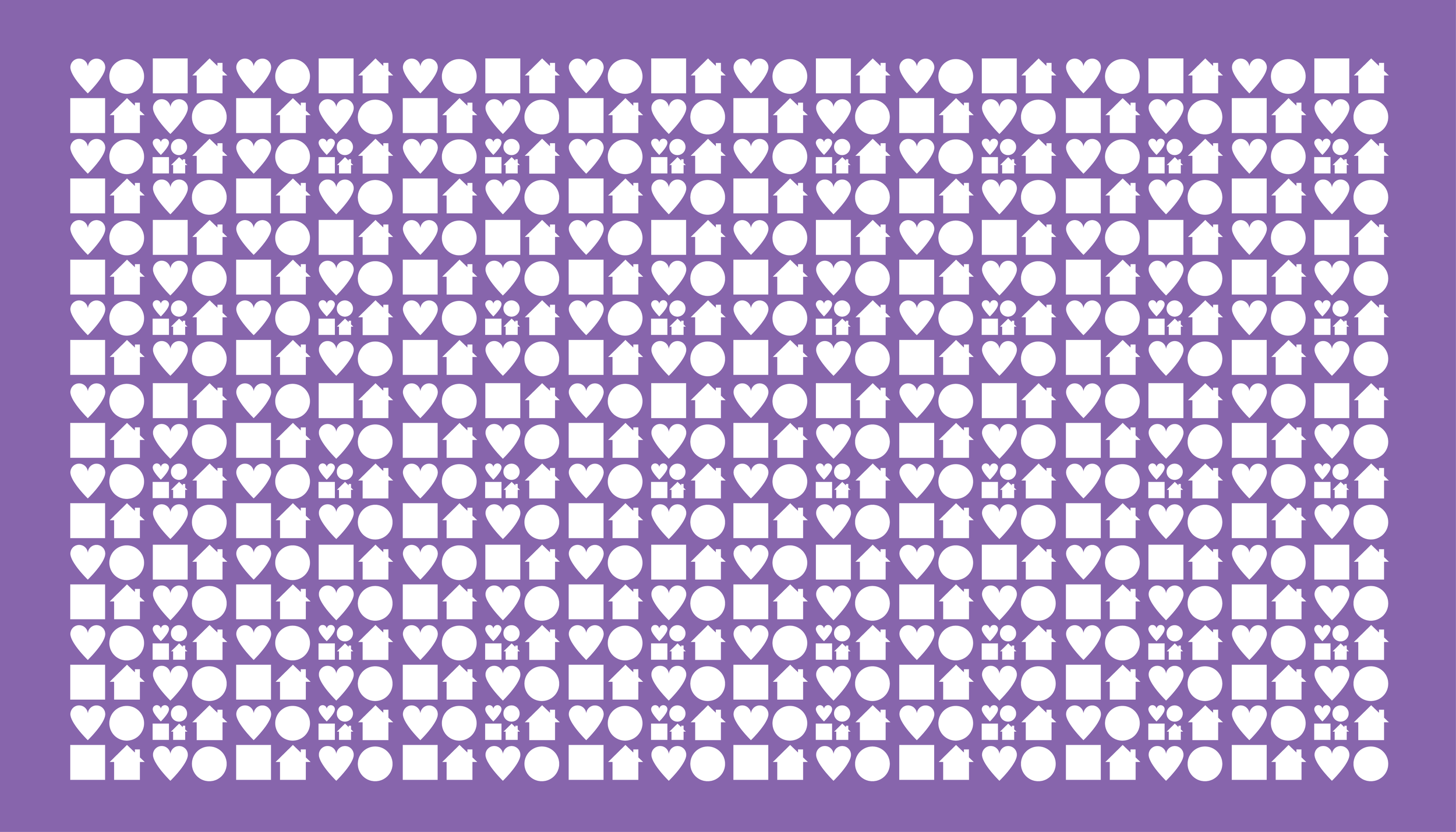
Results
The identity needed to be respectful but bold. It reflects the organisation’s proud history and bright future in all aspects of early childhood education. At its core is a clever evolution of their beginnings here in Queensland, and incorporates the colour jacaranda, as was Lady Gowrie’s wishes when she opened the Love Street site. Gowrie prepares children for life. CM Ink prepared them for their next phase of growth in Queensland.